From local to global

Service
- Positioning strategy
- Brand identity design
- Brand Environment design
- Corporate collateral
- Social media / Events
RMPCL is a producer of multi-micronutrients-rich Phosphatic fertilisers, Single SuperPhosphates, fortified fertilisers, various ranges of NPK and Soil conditioners. By placing an utmost emphasis on employee satisfaction and protection of the ecology through sustainable business practices, RMPCL aims to offer the highest-quality products, while ensuring a safe and healthy environment.
RMPCL launched Mahaveera Ziron, a 5 in 1 phosphatic fertiliser, which had an avant-garde packaging style. The product proved to be a massive hit, and the packaging was widely appreciated.
This provided an important inference to the company - farmers wanted packaging which had a premium, international look. The market was ripe for proactive experimentation with innovative branding models.
With their sights set on the future, they approached Huestorm with a desire to transform their branding and corporate communication strategy.
In order to provide impactful results, it was essential to understand what RMPCL's Mahaveera fertilisers stood for.
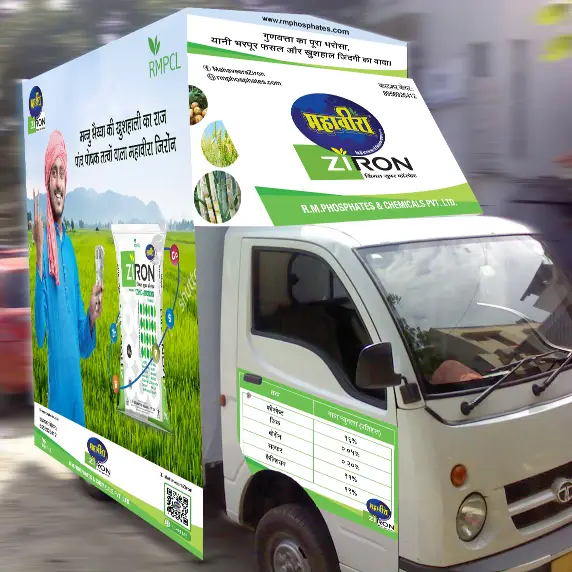
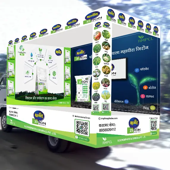
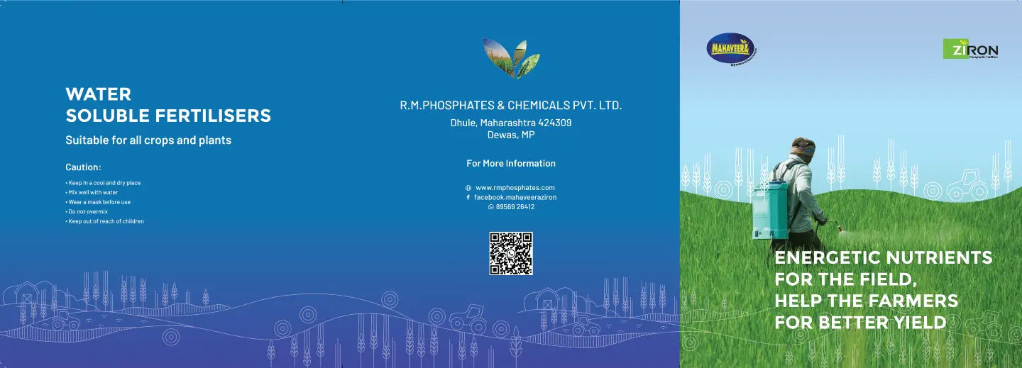
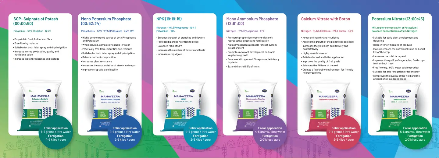
Intense, immersive research on the company’s products and business practices helped Huestorm achieve that. Proactive engagement with the company’s employees aided us in grasping the essence of the brand, making it easier to percolate it into every branding and corporate communication avenue which we had the privilege to design thereafter. We designed their packaging, product brochures, roadshow vehicle videos and handled digital marketing proficiently.
Thanks to the new strategy, Mahaveera Fertilisers is now recognised as a company equipped with innovativeness and vision, a brand that exhibits a promise of excellence and enterprising readiness. Customers are able to engage proactively with the brand and have reposed their trust in its potential. All of these developments set the stage for Mahaveera to start expanding nationwide. Onwards and upwards!
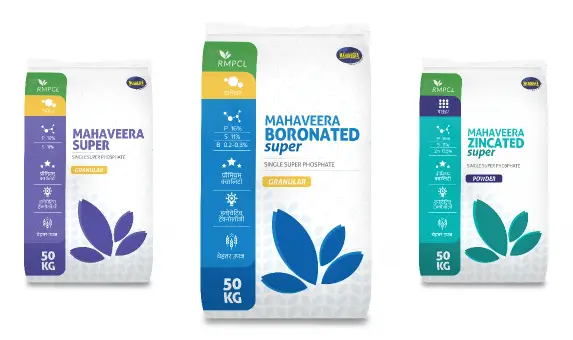
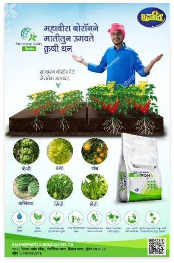
Mahaveera had brought 3 variants of Single SuperPhosphates to market: Zincated, Boronated and Super.
It was imperative that the marketing communication conveyed the features of each variant perfectly, but adhered to the underlying branding language which brought these three products together.
A new design methodology was thus evolved which conveyed how Mahaveera was no longer a brand entrenched in localized, run-of-the-mill packaging, but a soaring new brand that was aspiring for nationwide expansion.
One important learning along the way was the need to expand into more modern marketing avenues. Marketing efforts till that point were intended primarily for farmers in nearby regions, and had to be upgraded for a wider audience. The pressing need to expand into Whatsapp and digital marketing avenues led to several immersive engagements with various stakeholders, and many valuable insights were derived.
We designed several product explainer videos, posters, hoardings, and product brochures for Mahaveera. Creating their corporate brochure was a particularly intensive, but exciting exercise.
Roadshow Vehicle Videos were a crucial marketing touchpoint. Videos which were displayed transformed customers’ perception of Mahaveera fertilisers from a localised fertiliser company to a powerful brand which they could connect with proudly, a brand that resonated with the new India.
