Shifting focus from sales to science
Service
- Positioning strategy
- Brand identity design
- Brand Environment design
- Corporate collateral
- Social media / Events
Biorad Medisys is a renowned medical equipment and products company. Offering solutions in Orthopaedics, Urology, Gastroenterology, Gynaecology, Peripheral Intervention and Histream, they have established a reputation for innovation and impeccable quality.
They do business in India, Europe, Africa, Middle East, and Latin America, and have several joint ventures with major corporations across the world.
Having an extensive network of medical professionals who swear by their products is a testament to their scientific and research-driven prowess.
Top-quality materials and state-of-the-art manufacturing facilities had earned Biorad an impressive market share. Being too focused on sales was good for the time being. However, this aspirational company, in the long run, would need an impactful brand that would position the company as a reliable provider of top-notch medical products and solutions. It could not compete with international brands, even if it had the capacity to be just as good, if not better. Earning the confidence of medical professionals was therefore a challenging task, in spite of their excellent products.
Being an Indian company competing at the global level, it was important to shift from sales to science, and let the science speak for itself.
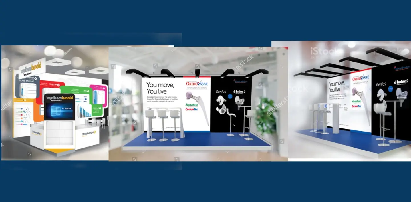
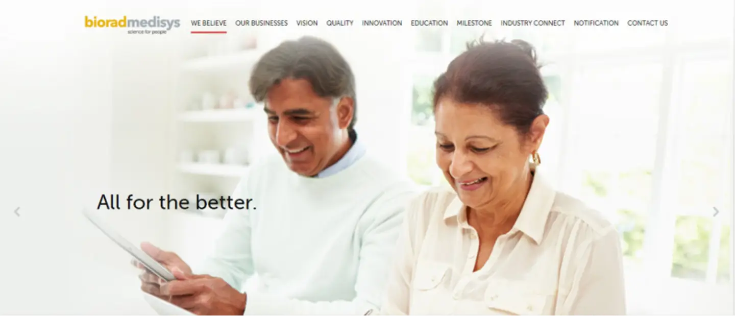
Huestorm successfully managed to incorporate the wide array of their product offerings and create a brand centred around science. An extra emphasis was laid on explaining Biorad’s resolve to offer innovative products after intense research. We designed Biorad's logo and crafted a tagline in sync with this vision. Differentiation of products through distinct design languages was achieved. Biorad's constant engagement with the medical community through industry events and myriad educational programmes was communicated prominently on their website.
After the revamp, Biorad ceased to be a seller of medical products. It transformed into a reliable brand that promised impeccable science and positive patient experience. A revitalizqtion of the sales process was achieved, as they were now equipped with a powerful brand identity. Brand recognition increased, especially because of the segmentation of products, which led to higher profit margins. Competing with confidence at the global stage became easier. Many of the international events Biorad was a part of were very fruitful, and many new joint ventures were announced as a result.
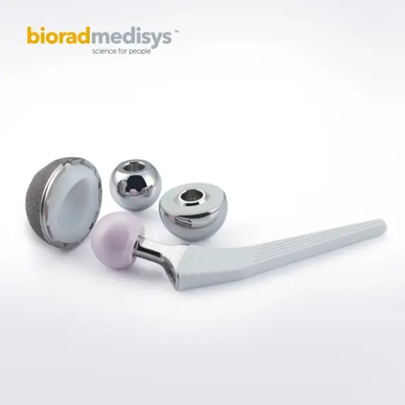
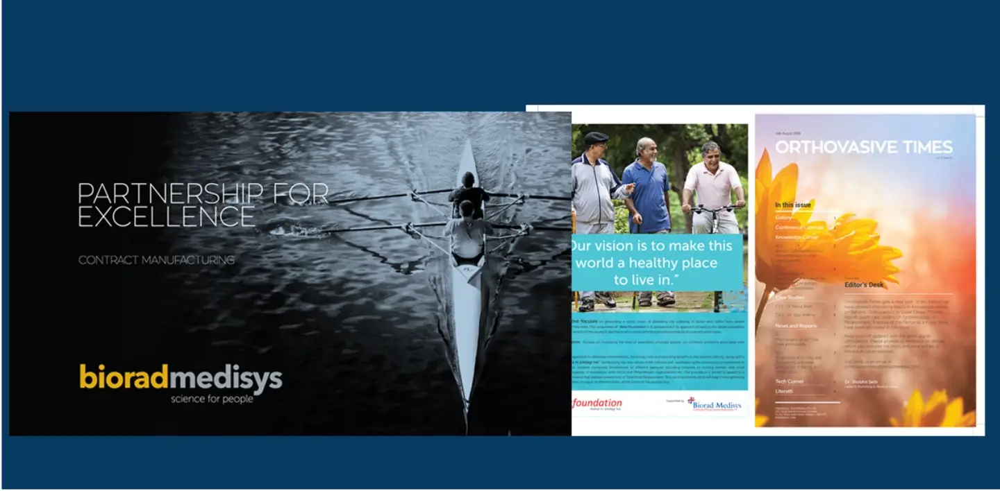
“SCIENCE FOR PEOPLE''- Biorad’s pursuit of excellence in their products and services was primarily to serve their customers. The science-centric ethos of the company, along with its singular focus on customer well-being, was effectively communicated with their tagline - “Science for People”
Huestorm also had the privilege to redesign Biorad’s logo. Biorad’s golden colour stands for the gold standard their products have set in the industry, whereas Medisys’s steel grey stands for technology, highlighting their expertise in medical devices, and differentiating them from other medical or pharma companies.
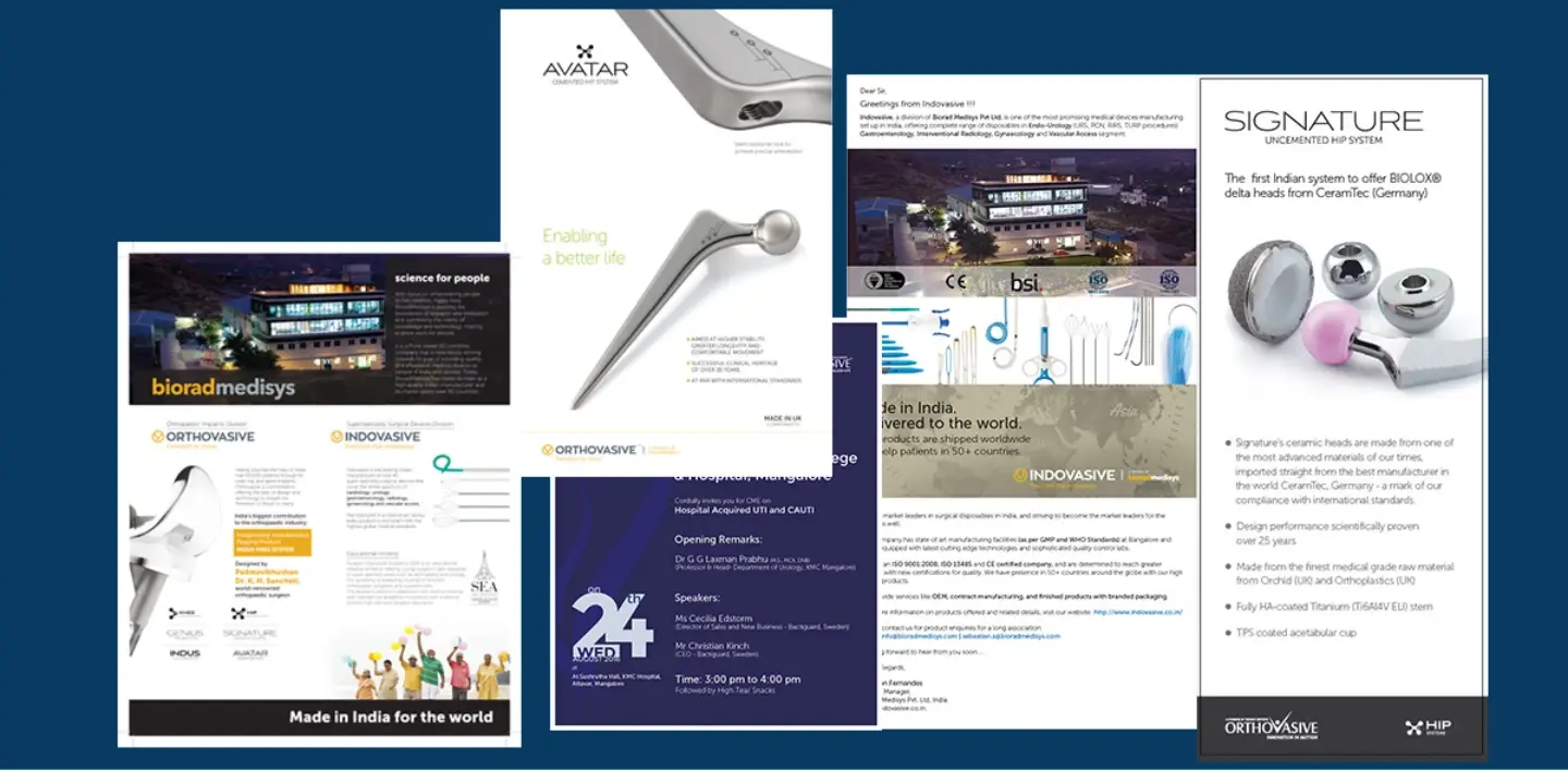
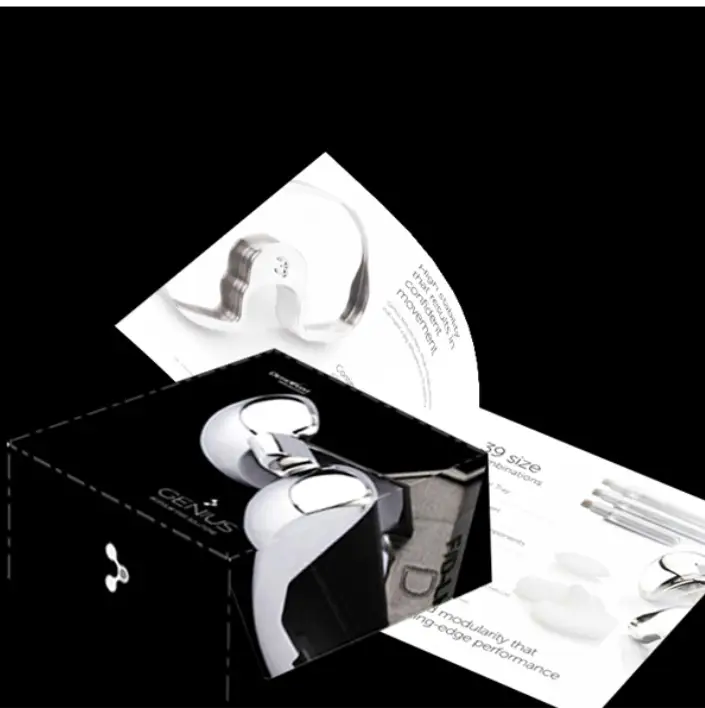
A corporate brochure and presentation in sync with the new branding strategy was designed.
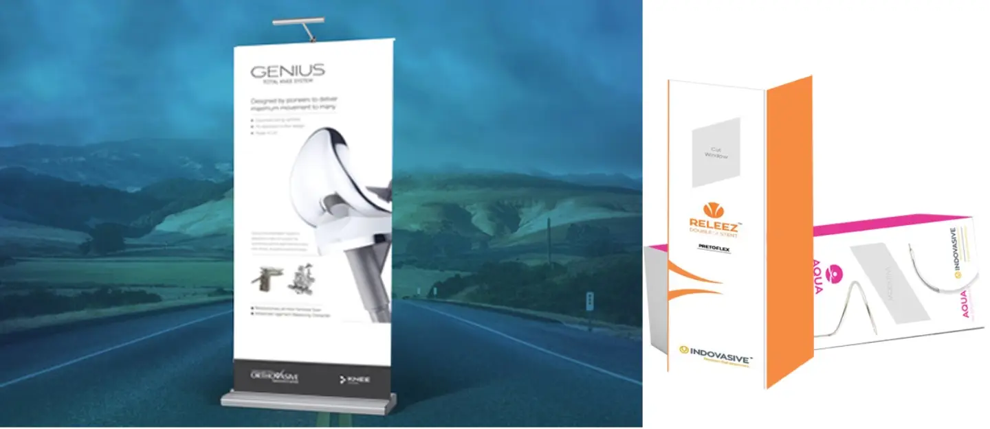
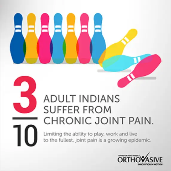
All products are made equal at Biorad, but some are more premium and higher-priced, while others are much cheaper. Huestorm had the challenge of creating design languages suited to each price range. The design would need to showcase the premium-ness or the economical-ness of the product. We created three categories of products- economical, medium and premium, and the branding thereafter was suited to that particular price range.
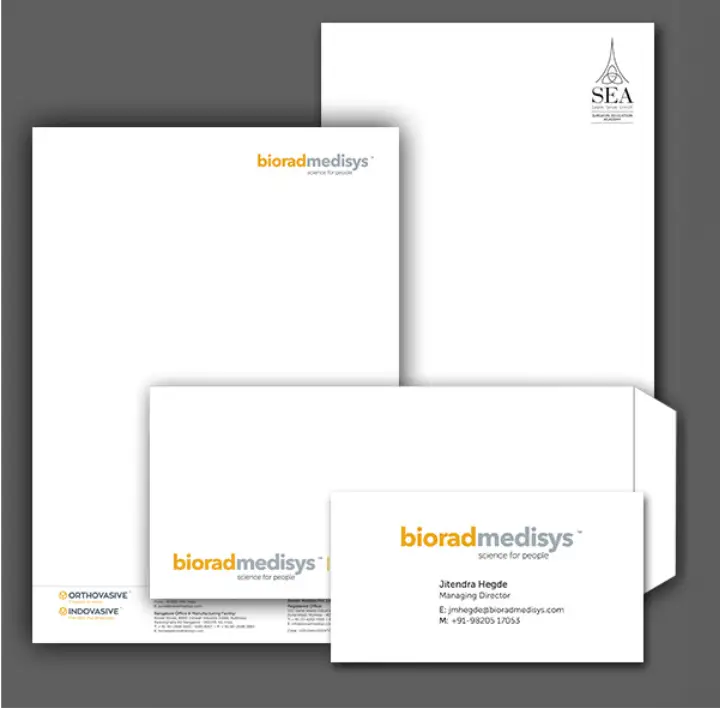
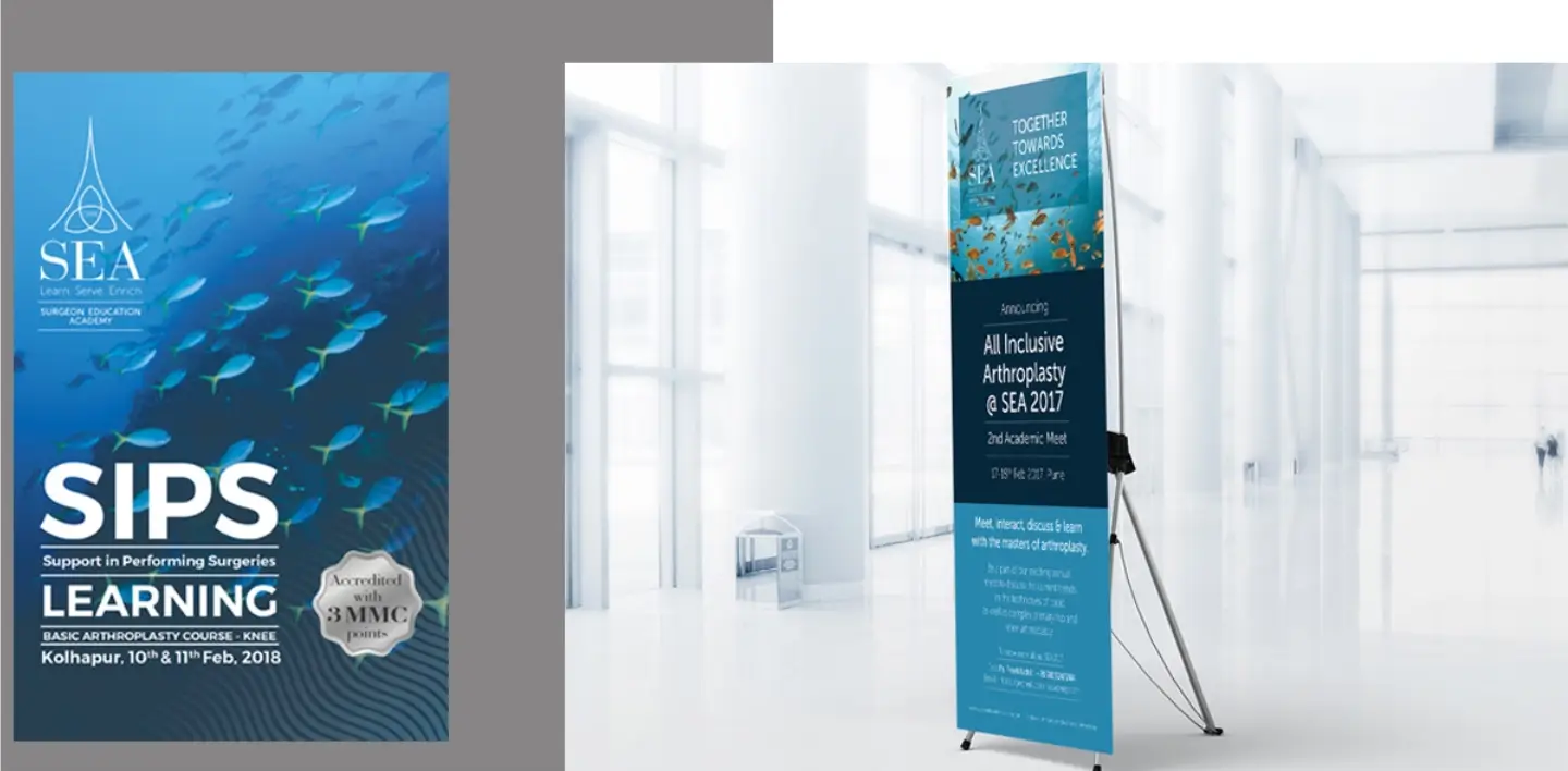
After the brand revamp, we also highlighted the proactive engagement that Biorad had with the medical community. This created a positive perception, and showcased how Biorad was going all the way to educate medical professionals to use their products. Additionally, Huestorm also designed posters, standees, backdrops and other event communication materials for the 30+ events Biorad participated in. A cohesion with the brand identity on the website helped the brand deliver a consistent messaging across all brand avenues.
